Background
This project was completed during a 24-hour hackathon hosted by Brainstation in partnership with Wealthsimple, where I collaborate with 2 fellow designers and 3 software engineers to come up with a solution to the problem:
How might we help Wealthsimple clients in Canada improve their financial literacy to make better financial decisions?
MY ROLE
UX Researcher
UX/UI Designer
UX Writer
Presenter
TEAM
3 UX Design students
3 Software Engineering students
TOOLS
Figma
Pen and Paper
Github
THE PROBLEM
Each team was presented with the following question:
How might we help Wealthsimple clients in Canada improve their financial literacy to make better financial decisions?
THE SOLUTION
Our team's answer to the problem was a contextual glossary feature to ease confusion about terminology on stock pages in the Wealthsimple app to help novice investors demystify jargon and inform decisions that will bring them closer to their financial goals.
But how did we reach this solution? Follow along to see how our team tackled the problem.
The clock starts... NOW!!
BREAKING THE ICE
With 24-hour time constraint and a diverse group of people who have never worked with each other, we first got to know each other a bit better so we could assess what strengths and knowledge we each brought to the table.
After that, we decided on mini-deadlines for the the project milestones to hit, creating a workback schedule for us:
8:00PM: Design idea finalized
11:00PM: Wireframes completed
9:00AM: High-fidelity screen designs completed, coding started
2:45PM: Coding completed
3:45PM: Project files submitted, presentation rehearsed
Spoiler alert: we ended up going past a lot of these deadlines, but having this schedule in place helped keep us all from getting siloed into our own work and focused on the overall goal.
EXPLORING THE PROBLEM
A really important thing we kept in mind at this stage is that even though our Software Engineering teammates weren't trained in UX research, it doesn't mean they couldn't get involved in the process.
From looking up secondary statistics to sharing their own personal experiences using Wealthsimple, we managed to get some valuable information despite not having the time to conduct formal user interviews.

The data we gathered from informal interviews of Wealthsimple users in our group, combined with statistics we found, helped us craft a user journey map and identify the pain point in their experience we wanted to address.
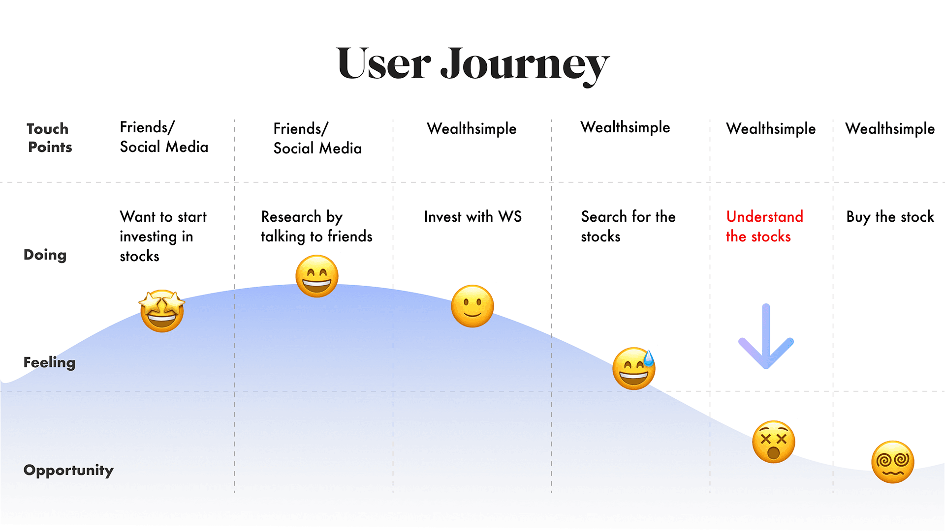
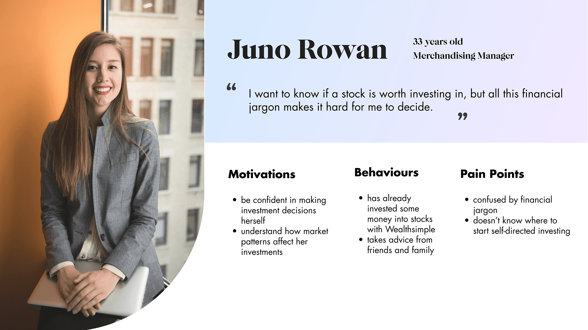
Creating a proto-persona based on the data we gathered built on the users' pain points and adds more context about their experience using Wealthsimple that will guide our team's design decisions.
With the significantly high percentage of data showcasing the need to learn investment jargon, we refined the initial How Might We question:
How might we help novice Wealthsimple clients understand investment jargon to improve their financial literacy to make better personal financial decisions?
IDEATING ON RESEARCH
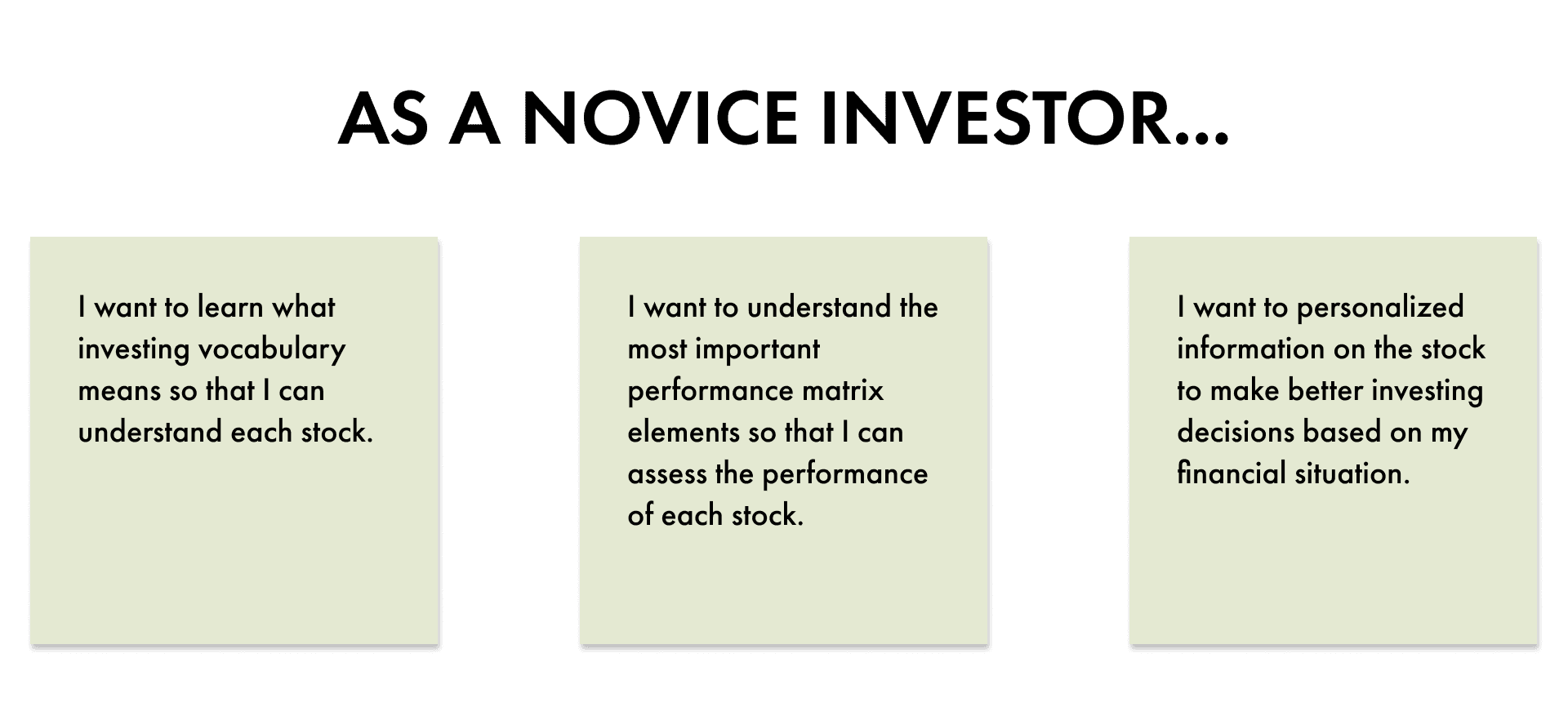
After capturing the opportunity for design intervention, we drafted user stories to create our solution features, following the original task flow trading stocks in Wealthsimple.
A financial literacy solution will look different depending on your existing level of experience, so we chose to focus on novice investors as opposed to intermediate or advanced investors, since the research we found mostly dealt with investors who were relatively new to investing.
DESIGNING WITH DEVS
At this point, I realized that we spent a lot of time on research and ideating features, missing on our intended deadline for settling on a feature.
Not wanting to hold up our team any longer, I consulted our developers while we sketched out the screen features to see what was feasible to do in the time left. Their estimations of how long it would take to develop certain features like animated modals influenced which sketches made it to high fidelity.
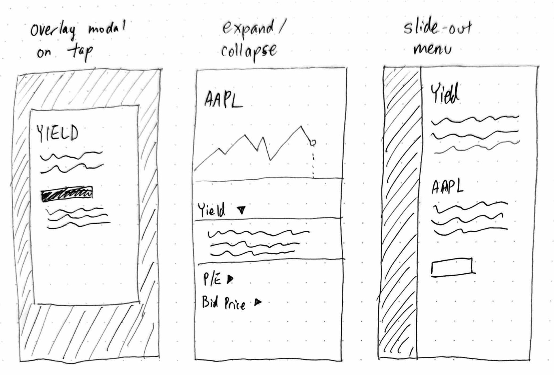


One thing that made our process more efficient was not waiting to have all of our screens designed before developer handoff. As soon as one screen was done, we passed it along to them to begin development while we designed the second screen.
FINISHING TOUCHES
We were able to prototype the main screens and handed them off to the software developers, and they successfully built all proposed elements and interactions in time before the hackathon ended.

While they were coding, we designers put together the slide deck to present our solution to the panel of judges. Storytelling is a huge part of any UX designer's job, and by this point in our program we were pros at it.
Of course, our developers weren't there just to run through the technical demo; we looped them into our presentation so that they could tell the story with us!
PRESENTING THE RESULTS
As a reminder, let's take a look at the initial problem posed to us:
How might we help Wealthsimple clients in Canada improve their financial literacy to make better financial decisions?
...which ended up being refined to...
How might we help novice Wealthsimple clients understand investment jargon to improve their financial literacy to make better personal financial decisions?
And how does our solution address this?
Financial literacy improvement
Having an explanation page for each stock performance term allows novice investors to learn more about the financial terms they encounter in the app. Including tailored information also helps improve understanding as it relates directly to their current investments and financial goals.
Along with that, the less cluttered simplified view makes the stock page look less daunting, and allows novice investors to easily explore different aspects of a stock's performance little by little.
Making better financial decisions
The tailored information on each explanation page includes information about how each metric affects the investor's financial goals, allowing them to make better, informed decisions about their investments.
CLOSING REMARKS
My first hackathon experience was definitely an eye-opening experience and I was able to take away some really great learnings from it.
Information transparency is key. Because each team member listened and communicated, we had very realistic expectations of what we could accomplish within our time constraint. We were among the few teams to have a working technical demo of our prototype by presentation time.
Roll with the punches. We didn't hit all of our mini-deadlines, but what mattered is how we adjusted our strategy when things didn't go the way we expected. We simplified our workflows, as well as our design ambitions to what was needed to solve the user's problems.
Have a great mindset. As designers, we didn't monopolize the parts of the process we excelled at; in fact, we took every opportunity to incorporate our software engineering teammates into the research, ideation, and prototyping stages to reach solutions more quickly.